|
Software Development Magazine - Project Management, Programming, Software Testing |
|
Scrum Expert - Articles, tools, videos, news and other resources on Agile, Scrum and Kanban |
Testing Performance of Mobile Apps - Part 2: A Walk on the Wild Server Side
Alan Trefzger, www.xbosoft.com
Introduction
We used to come to work, sit down in front of our computer and check the news, reply to emails, and do online shopping. But now we do all those things on our mobile device while commuting to work (hopefully while not driving). And our mobile Internet usage is projected to pass desktop Internet usage in 2014 [1]. The world has changed but our expectations have not. We expect the online experience to be as fast as our desktop experience, but it isn't, and that is a problem.
For mobile commerce, customers expect a page to load within 4-5 seconds.[2] In Web Performance Today, Nov 2011, a case study showed that "a 1 second delay in load times led to dramatic losses in bounce rate, page views, conversions, and cart size".[3]

Figure 1: Results of 1 second delay in Load Times [4]
The problem is the same for information providers. Google found that a .5-1 second increase in page load time resulted in a 20% decrease in traffic and revenue. [5]
But how to ensure the same high quality user experience as your desktop is a difficult problem. Evaluating and testing the performance of a mobile application is not as straight forward as evaluating and testing the performance of traditional web-based solutions as there are several other variables such as application structure (browser versus native), network used (2G, 3G, 4G, etc.), payload structure, etc.
Performance testing of mobile devices and client applications was covered by Newman Yang of XBOSoft in his "Testing Performance of Mobile Apps - Part 1: How Fast Can Angry Birds Run?" But that is only a part of the performance problem.
Mobile browser-based application performance is usually heavily dependent on network and server application performance. Overall, mobile is much slower than desktop. "The median web page takes more than 11 seconds to load on both iOS and Android devices, compared to about seven seconds on the desktop."[6] Mobile is slower, but it doesn't have to be.
Objective: In this article we will address server performance for a mobile application. Since Server issues are very similar for both mobile and full websites, we will look at testing the server which has already been tested and working for a desktop website. Once the server has proven to be stable and performing well for this narrow test, then we can continue onto performance testing for the network.
Differences between Mobile and Desktop usage
Fat vs. Thin data pipe: The mobile web is different than how you use the web on your desktop. When accessing an Internet site, a web page is delivered from a server directly to your desktop through a high speed, broadband data pipe. But for mobile, the data pipe is much thinner.
Many Tower connections: For a mobile connection, not only is the pipe much smaller, but the data has to pass from tower to tower before it gets to your mobile device. This is one of the reasons your mobile user experience can be up to 2 times slower than the desktop experience.
Smaller, less powerful device: Your mobile device has a less powerful CPU, less RAM and a smaller screen resolution. The server needs to take this into account.
Navigation: Your finger is used to navigate so touches have to be translated into clicks.
Data Usage: As data plans charge by the data usage, a different philosophy is needed to speed up performance. Many websites anticipate what you might click on next and preloads those pages. Some websites preload all the next level pages. This can greatly speed up the user experience for the desktop, but for the mobile device, it takes up valuable bandwidth and can be costly.
These differences (and more) means that you have to approach mobile devices differently than when content is being served to the customer.
Proxy servers - Know what is going on behind the scenes:
When you test, you need to know what you are testing. Sometimes the data coming back to your mobile device is not coming from the server of the URL that you requested, but from a proxy server that reformats the data and then sends it to the mobile device. Some Nokia devices and Opera mini browsers, both request web pages through proxy servers, which process and compress them before sending them to the client mobile phone, speeding up transfer by two to three times and dramatically reducing by up to 90% the amount of data transferred. Since many data plans charge by the amount downloaded, the savings can be considerable. This pre-processing by the proxy server increases compatibility with web pages not designed for mobile phones.
So when you are testing, you need to know whether or not you are going through a proxy server, like the servers that Opera Mini uses. For if you test through a proxy server, then your results will be dramatically different, and probably better than if you didn't. Since most users will access your servers through a non-proxy server, (unless you require Nokia devices or Opera browsers) you must make sure you are testing in non-proxy server environments.
First step, a simple comparison test:
There are three approaches to making your websites accessible to mobile devices. The first and most common approach is to develop a mobile version, a m.site, of your full website designed for the desktop. The second is a mobile app and the third is to make your full website more mobile friendly. In all three cases, the first step is a simple comparison test.
Example: XBOSoft has a full version website, xbosoft.com, and has developed a mobile version, m.xbosoft.com. A performance test was executed to compare the times between the full website on a desktop, the full website on a mobile device and the m.site on a mobile device. IE8 was used for the desktop test. A Wi-Fi network was used for all three to eliminate network issues with 2g or 3g networks. An iOS 5.0 and an Android 2.3 phone were used and their results averaged. Both a first access (no cache) and a repeat access (caching) was used. Six tests were performed on each device and the results averaged.
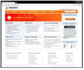


Figure 2-4: xbosoft.com on desktop - xbosoft.com on iPhone 4 - m.xbosoft.com on iPhone 4
|
Comparison of Load |
First download |
Repeat download |
|
xbosoft.com on desktop |
7.5 |
3.1 |
|
xbosoft.com on mobile device |
14.8 |
4.4 |
|
m.xbosoft.com on mobile device |
9.1 |
4.1 |
The development of m.xbosoft.com was considered a success for two reasons:
- m.xbosoft.com was 40% faster than xbosoft.com on the mobile devices, and
- m.xbosoft.com was easier to read than xbosoft.com on the mobile devices.
Analysis of Server Performance
You have decided on your approach, now you want to carefully analyze your servers' performance. This next step is critical for all three approaches. There are many good tools in the marketplace, but we would like to start with webpagetest.org.
Example: We will use our previous example of xbosoft.com and m.xbosoft.com and describe how we would go about improving the server performance.
First run a test on xbosoft.com and m.xbosoft.com
Go to webpagetest.org and enter:
- Website url - xboxoft.com and m.xbosoft.com
- Test location (pick one), and
- Browser - iPhone 4 iOS 5.1.
Results of webpagetest.org
Webpagetest.org gives a grade on six areas where significant performance can be made. For this test, significant improvement can be made in 5 of the six areas measured. If performance requirements are not being met, this is a quick way to identify what areas to work on to improve performance.

Figure 5: Summary Scorecard for xbosoft.com on iPhone 4 iOS 5.1
- First Byte Time - time for receiving first byte for the page.
- Keep Alive Enabled - connection socket is kept open so that many objects can use it.
- Compress Transfer - compress object types "JavaScript" or "text".
- Compress Images - compress object types "image".
- Cache Static Content - controls expiration of objects in cache.
- CDN Detected - Content Delivery Network, Is a distributed system of servers being used?
Next, the Load Time is given for viewing the page the first time (no caching) and for repeat viewing (with caching). For this test, the caching of the objects dramatically speeded up and improved the performance.

Figure 6: Load Time Summary for First View download and Repeat View download
The Connection view shows each TCP socket and the requests that are retrieved over them. If there are too many connections, then make sure the 'keep alive' setting is enabled. You can also reduce the number of connections by combining js/css files, images, etc... In this example, connections were kept to a minimum, increasing performance.
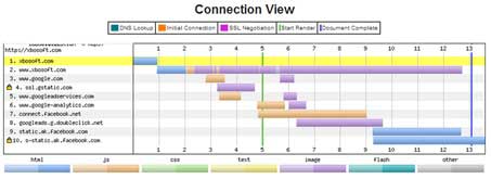
Figure 7: Connection View of each TCP socket opened
The Waterfall view gives the developer a detail look at each component, image, js/css file, etc... and how long each takes to load. A component that is taking too long can quickly be pinpointed and fixed (or eliminated).
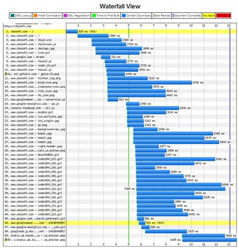
Figure 8: Waterfall View of time of each object downloaded
Next look at the repeat view when accessing the website with caching heavily used. Most of the page was successfully cached and resulted in a dramatic reduction in time.


Figure 9: Connection and Waterfall View for repeat view download
Webpagetest.org provides a considerable amount more of detailed information to further pin point where performance enhances can be made.
There are many good tools in the marketplace, but webpagetest.org is a good place to start in evaluating your server's performance. This quick and free test can bring immediate results for the most common and simplest problems.
Load Testing of Server
Your server has been load tested for your desktop website and now you are ready to bring your mobile app online. Some preliminary analysis of the mobile usage shows a lighter load on the server. This would be caused by smaller bandwidth demands on server connections and network latency which means that the server will receive fewer requests per second. Since the load on the server should be less for a mobile user than a desktop user, you feel fairly confident that the mobile rollout should go smoothly. This was the reasoning of the mobile project manager for an international bank who decided not to do any performance load testing before their mobile app went online.
This proved to be a disaster. The servers crashed as the mobile apps went online, and this was with only 5% of the users using mobile devices to access the server. The greater latency of the networks caused the server to hold open and extend sessions. This caused the backend server to use more memory and CPU time than the thresholds allowed, which caused the servers to crash. Performance load testing for mobile is sometimes seen as optional. This is a huge mistake as the mobile project manager for the international bank found out.
To test this website for mobile access, one should start with a server that has been load tested, for example, 500 users for the desktop application. Then add one mobile app user at a time and monitor the effect on the server. In the above example, the transaction times doubled, degrading the system at just 10 mobile users, and the servers crashed when it approached 25 mobile users. [7]
Using a tool, (for example HP's LoadRunner along with Shunra's vCat) one can simulate the 500 users and emulate mobile conditions for the mobile users.
Server Mobile Site Optimization Strategies: These strategies are applicable for both full and mobile site optimization, but are particularly applicable to the challenges of mobile performance.
Reducing the number of HTTP Requests: Round trips between the client and server cause the biggest degradation in page loading performance. Completing dozens of round trips to retrieve resources such as style sheets, scripts and images is especially damaging to performance for the mobile device because of the high latency of the network and relatively low bandwidth of the connection. Let's look at a number of ways to reduce these requests.
Consolidating Resources: Consolidating JavaScript code and CSS styles into common file to be shared across multiple pages is standard practice. Images can also be consolidated, but you have to be careful to pay attention that your consolidated file isn't too large for caching in local storage.
HTML5 Web Storage: Browser Caching, a standard optimization practice for desktops, doesn't work as well for mobile devices because of the small size of local storage for caching. However HTML5 web storage can be an alternative. For all practical purposes, it is the same as caching, but much faster and more efficient.
Embed resources in html for first-time use: Inlining a resource, like an image, instead of a linked reference it can speed up the page load tremendously. However, again, you have to watch the size of your page so that it doesn't become too large. This is commonly used with HTML5 web storage.
Unidirectional server updates: The server updates the client on a regular basis. For most applications, this does not need a bi-directional channel for back and forth communication with the client, but just an update at regular intervals. Of course, for messaging and gaming, bi-directional is required, but for information updates, a unidirectional channel is sufficient.
Reduce Payloads: Compress, resize and simplify. Sometimes the obvious is the best solution. To speed up payloads, smaller is better and faster. Not only does smaller reduce bandwidth consumption and latency, but it also can make the difference between a cacheable object and an uncacheable object. [8]
Compress: Compress on the server side and uncompress in the client. This can reduce the size up to 70% and tests have shown that this can significantly improve the performance.
Resize: Page loads the correct size image for the mobile device. Not only will this make the object smaller, but it saves processing so the client doesn't have to resize the image. The small screen, many times, doesn't require as high a resolution and finally, you can down load a very low resolution image at first, and then update it when the page has finished loading.
Simplify: HTML5 and CSS 3.0 provide many elements that used to require JavaScript. Updating your website to include these new standards will greatly simplify and decrease the size of your webpage.
Conclusion
Moore's Law for computer power and storage and Nielsen's Law for Internet bandwidth will ultimately solve mobile devices' current performance problems. This will lessen the need for mobile apps and m.sites. However, that could be well into the future, until then, choosing between making the full site mobile friendly, developing a mobile app, or promoting an m.site should be done carefully, being well aware of the tradeoffs.
References
- http://www.shunra.com/products/shunra-vcat-mobile
- Mobile consumers expect speed greater than many retailers are providing, Internet Retailer, August 7, 2012.
- Case Study: The impact of HTML delay on mobile business metrics, Web Performance Today, November 2011.
- 2012 State of Mobile Performance, strangeloopsnetworks.com, p. 6.
- http://glinden.blogspot.com/2006/11/marissa-mayer-at-web-20.html
- http://marketingland.com/mobile-browser-speed-battle-ios-devices-faster-on-3g-android-faster-on-lte-23364
- Why Mobile Apps Fail after Deployment, webinar by Shundra on Apr 16, 2012.
- 2012 State of Mobile Performance, strangeloopnetworks.com, p 10.
Mobile Load Testing
Testing Performance of Mobile Apps - Part 1: How Fast Can Angry Birds Run?
Testing Performance of Mobile Apps - Part 3: The Network
Software Testing Knowledge
Software Testing Tutorials and Videos
Load Testing Tools and Performance Testing Software
Click here to view the complete list of archived articles
This article was originally published in the Winter 2012 issue of Methods & Tools
|
Methods & Tools Testmatick.com Software Testing Magazine The Scrum Expert |
|
Browse a selected list of upcoming Software Development Conferences |
Copyright © by 1995-2024 Martinig & Associates |
Privacy
Follow Methods & Tools on


