|
Software Development Magazine - Project Management, Programming, Software Testing |
|
Scrum Expert - Articles, tools, videos, news and other resources on Agile, Scrum and Kanban |
The Psychology of UX
Vanessa Carey, Caplin Systems, http://www.caplin.com/
Ever since I found the blog 'What Makes Them Click' [1] by Susan Weinschenk, I've been fascinated with her writing. I'm a natural analyst, much to some people's dismay, as I mentally poke and prod people till I really understand what drives people to behave the way they do. This has led me to study Product Design, Anthropology and to now be employed in the UX industry in an attempt to understand people and better their human experience. So when I read Susan's post on 'The Psychologist's View of UX Design' [2], I was fully engrossed in what she had to say on the matter.
Her article broke down several areas of study relating to the brain, memory and the visual systems in humans to explain how these are relevant to UX. I will break down Susan's post and further explain my understanding of each of her ten points and what this has meant to my experience of UX thus far or the direction I'd like to take my own UX practices within a professional environment.
10 Things to About Human Psychology That Should Inform UX Design
- People Don't Want to Work or Think More Than They Have To
- People Have Limitations
- People Make Mistakes
- Human Memory is Complicated
- People are Social
- People are Easily Distracted
- People Crave Information
- Most Mental Processing is Unconscious
- People Create Mental Models
- People Understand Visual Systems
1. People don't want to think or work more than they haveto
Firstly, I don't think many people are going to debate this point if they are really honest with themselves. I'm not arguing that we can't all have bursts of motivation and be hard-workers, but *ultimately* we are all lazy (or 'efficient' as Susan puts it).
And there's a very good reason for that. Throughout our evolution, we've managed to survive longer if we successfully conserved our energy. This means that we would focus on exerting the least amount of energy possible to attain our core needs (water, food, sex, shelter and protection against danger/threat) as we couldn't be certain where our next meal was coming from and if we'd have a calorie shortage.
Today that's clearly not the situation with food in every corner shop, but the behaviour is still ingrained in our genes and we can't shake it off easily. If we take the example of hard-workers who may contest that they are not lazy, the fundamental reason for their effort to climb up the career ladder is money which equates to being able to purchase our core needs (water, food, sex, shelter and protection against danger), so perhaps being a career-person is the laziest choice for attaining those essentials (rather than say building a house for yourself, digging a well to get water or hunting a caribou for hours).
So now that we've established the idea that people are all ultimately lazy...
Let's explore some examples of how people are lazy on the world wide web
Susan references Steve Krug's book, Don't Make Me Think [3], where he states that 'people typically glance at websites and scan the content, clicking whatever they first see that catches their interest or vaguely resembles what they are looking for, rather than reading the whole page.'
Absolutely. You know it! I'm sure you've been to a badly designed website before where you get to it, there is a plethora of text bombarding your eyes, you get overwhelmed and quickly scan for a word that relates to what you are looking for and starting clicking away. A few clicks forward, a few clicks back and you are horribly lost. You leave the website. This approach happens with not-so-badly designed websites as well though hopefully you will find the content you are looking for on these in a short amount of time.
People like short cuts (a faster way of doing something). Particularly if they have to do the task over and over. This is just another way to conserve energy through using your mind to find a lazy-friendly approach. However, interestingly, Susan points out that if it takes too long or too much effort for you to discover the short cut, people will default to the tedious, lengthy approach. In other words, we can be lazy about finding a solution that will allow us to be even lazier. Ha!
A few web examples of short cuts might be when you are filling in a form, you might copy and paste data (such as your email), or have auto-complete fill it in for you. Similarly rather than remembering all of your passwords you may use a password-storage system in your browser that also auto-saves your passwords for you. However if initiating these services is too confusing to find, you may just take the extra time to type out your email address twice in a row or rattle off 5 passwords before you find the right one.
In the same vein, the term 'satisficing' was coined by Herbert Simon [4] that combines the words 'satisfy' and 'suffice'. The formal definition for 'satisficing' is a decision-making strategy that attempts to meet criteria for adequacy, rather than to identify an optimal solution. As we do not possess the cognitive ability to weigh all the options, we settle for what is good enough rather than waste the energy trying to identify the best solution.
A web example of this could be when you are searching on Google - rather than go through the extensive pagination to find the *perfect* answer to your query, you are likely to settle for some item on the first three or four pages.
So those are a few examples of people's laziness factor, but...
How can we consider this when designing the UX of websites?
Simple: allow people to do as little as they have to (including thought) to achieve the desired outcome on your website.
For instance you could:
- Make your website more scannable by using less text and adding more imagery (as humans are 90% visual creatures).
- Bouncing off the point above, show examples or explanations through imagery rather than text.
- Create clear and visible navigation with wording that is familiar (i.e., don't be overly imaginative with your wording as it can confuse people who are used to web standards like 'home' and 'contact'. But that also doesn't mean you should talk like you are a computer in crazy code "Error 3.106 is faulty because of PHP.zipfile corruption 27695..." You get the point :)
- Provide defaults and short cuts that cater to common work flows. For example, if you are creating a email website, make the buttons/access to the area where you 'compose' an email or 'read' emails dominant over other less important tasks.
- Make things that are clickable, look clickable [5] and things that aren't, not. For instance, make links have underlines or different states when hovered over.
- Don't overcrowd your website with content. Give people a little bit of information and then offer the opportunity to learn more through subsequent clicks.[6]
- And most importantly, find out your users' true needs so you don't overcrowd the website with unnecessary functions, content and clutter. Design for their desired needs and work flows only!
2. People Have Limitations
If you are multi-tasking while reading this article, please stop! I need your full attention. Seriously. Let's find out why.
Multi-tasking is a modern trend where we try to mentally manage two or more tasks simultaneously with the (erroneous) belief that we are optimising productivity. For instance, you might be at work checking your emails, while also filling in an excel spreadsheet, reading the news, chatting to your co-worker about internal changes, drinking a cup of tea, and browsing some websites to gather research for a presentation you are putting together - all at the same time. This might be a typical work day for most people.
At home, media saturates the multi-tasking experience even more with people often watching TV while browsing numerous websites on their laptop and texting a friend on their phone. This kind of behaviour has become so commonplace in our society today that most people would agree they do this, and most would also defend their ability to manage multiple things going on at the same time. But they'd be wrong.
Don't believe me? Try this experiment. Think about the taste of chocolate while you mentally add 38 and 272. Mmm, 310 is my new favourite flavour! No, but in all seriousness, you couldn't do it. It's impossible.
The origin
....of the word itself helps us understand how far removed this method of operating is from the way the human mind works. In fact, the term 'multi-tasking' came about from the computing industry back in the 1960's to refer to the ability of a microprocessor to process several tasks at the same time. It wasn't until 1998 (only 13 years ago) that humans started adapting the word to themselves. So in retrospect it is a very new concept and an even newer practice for human beings to be undertaking.
But what about historically speaking? Did our ancestors multi-task without knowing they were "multi-tasking"? Sure. Human beings have always had the capacity to handle several things at once since the time of hunter-gatherers. Mothers would pick berries while feeding their infants, or preparing food while keeping an eye on their children.
Men would have had complex, long hunts where they had to have mental maps of where their buddies were in hiding to optimise their approach in hunting the animal, simultaneously remaining quiet, exploring the land with their feet to ensure stability and preparing to attack. Because of this need, we developed part of our brain known casually as 'the executive system' and officially as 'the prefrontal cortex'.
This front lobe of your brain conducts your focus by helping you ignore distractions and switch from task to task. But nowadays it seems our assuredness in our ability has surpassed the ability itself. You might have experienced this if you ever have tried to type a message to a friend on a computer while someone else talks to you in person. Your mind tunes out the voice and while you can pretend you are paying attention, you will most likely have to ask them to repeat themselves.
The way the prefrontal lobe works is that it can only process one thing at a time, but it can switch between two tasks very rapidly. You can do more than one thing seemingly at the same time, but in reality you are ordering them and deciding which to do at that specific time. However the negative side to switching from task back and forth again and again is that it takes about one minute to recover our train of thought, breaking our concentration and making us unfocused. For full concentration on one task to be re-established, it can take fifteen minutes! In this mode we are only capable of superficially scraping the surface. This in turn is more counter-productive than anything else.
"The general understanding people have of multi-tasking is a bit of a misnomer. I've never seen any examples of anyone who can do three or even two intelligent tasks simultaneously," says neuropsychologist Prof Laws
Nowadays the speed and amount that we multi-task has exploded due to technology. Software often requires us to think about multiple things at the same time. For instance, if the predictive text feature on your mobile phone is correctly amending what you are writing as you write it, you are forced to pay attention to two very similar tasks. And if the tasks are too similar they compete for the same space in the brain, and you mentally can NOT focus on both at the same time. Yet if one task is something more automatic or highly practised like walking or breathing, we can do another conscious task simultaneously as we require very little processing to perform the first function.
So why should we care?
Multi-tasking is very popular these days. It hints at productivity. It seemingly allows us to split our attention (most likely from one or more things we don't want to do.... and potentially another we do - like watching TV while you do your homework). This makes the work become less tedious. While this practice can be easy to fall into, we should avoid it as it will take us longer to accomplish any one task, not to mention the quality will most likely fail.
Even more importantly, the brain needs time to recover between switching between tasks to gather its thoughts. Without this time, the individual will be over stimulated and quickly become stressed out with all of the effort they are giving to multiple tasks. Too much multi-tasking can condition the brain to an overexcited state which makes it hard to focus even when you want to. This makes for unhappy, unproductive and exhausted workers. Do you really want that?
How can we overcome this?
Well, the honest answer is: we can't.
"With such complicated tasks [you] will never, ever be able to overcome the inherent limitations in the brain for processing information during multitasking. It just can't be, any more than the best of all humans will ever be able to run a one-minute mile," says David E. Meyer, director of the Brain, Cognition and Action Laboratory at the University of Michigan
We should respect the way our mind works and work in a similar fashion. From a UX perspective, we can design software, websites and all digital interfaces to minimise distraction and focus the user's attention onto one task at a time. This means you can't have all the tools in the toolbox in front of you when you work. We can give our users more of a holding hand as they are guided through a clear workflow that helps them accomplish one task, and THEN another... and another. One at a time, considering what communication and information is really worthy of interrupting your precious concentration and when you should seek out new data.
At my company, we are really starting to consider ways that we can incorporate this approach of one task at a time into our designs so that our users won't be as overwhelmed with the amount of data available to them. The financial world seems to LOVE throwing every single piece of data onto every possible screen they can, which must overwhelm users of these systems immensely. While seemingly giving the user a feeling of power with all of this information at their fingertips (this is the upcoming topic for The Psychology of UX: Part 7 coincidentally), realistically they are only able to focus on one item at a time, flitting from one to another to another to another to another, trying to remember what they were thinking just a second ago. Are you exhausted yet? I am.
One way we can 'trick' our mental system though...
is to multi-task tasks that don't share attentional resources, i.e. use different sensory inputs. Like visual and auditory, which can work together without interfering at times. One really cool example we found of this was a chart that has supporting sounds to reinforce the direction of movement of the graph, which helps reinforce understanding. Check it out for yourselves! [7] Imagine the potential for tapping into our user's various senses to help them quickly understand what they are seeing, as well as helping them focus, and in turn be more productive.
Simplifying a user's workflow
...and the maximum things they can do at one time, teamed with tapping into our various sensory systems may be the key to creating interfaces that are designed with the user in mind: a human being, not a microprocessor. Mono-tasking should be the new multi-tasking. Spread the word.
I attempted to multi-task when writing this part of the article for the irony and it took me four days of occasionally writing a sentence before I got fed up. On the final day when I decided to mono-task (it'll catch on ;) ) I managed to compile this in an hour or so. Proof, it works!
3. People Make Mistakes
What exactly is a mistake?
"..a decision or action, or lack thereof, that we fear we'll come to regret. They usually cause some degree of pain, loss or struggle," says Mel Schwartz from Psychology of Today. [8] For a more software-based explanation we might say a mistake is simply something that is wrong or that causes a problem with a user's normal workflow.
Yes, mistakes. We all make them. We wish we hadn't. One snooze button too many. Spending money on things we shouldn't. Having that extra cocktail at work drinks and breaking out your embarrassing dance moves....I'm divulging too much of my personal life. But what about mistakes in the digital world? What happens when a user makes a mistake on a computer? These are things we will cover in today's post.
'Assume people will make mistakes. Anticipate what they will be and try to prevent them.'
Susan Weinschenk stated the above in her 'Psychologist's View of UX' post, the inspiration for this article.
Why would we want to prevent them though?
Well aside from mistakes causing users great frustration and pain when interacting with a system, mistakes can be rather costly, particularly in the financial sector where a user might be trading thousands, or even millions, of dollars with one click. It's imperative when designing the user experience for financial interfaces to make the workflow easy-to-use and error-free.
So how do we prevent errors?
The best error message is no error message. What this means is that a system that is designed well will not allow the user to make an error to begin with. The main way we can accomplish this is by predicting what mistakes a user might make, based on knowledge gathered by researching the environment they operate in and their needs with the system. We can then adapt our designs accordingly to avoid allowing those mistakes to be made in the system.
If the task the user will be conducting is very complex or error-prone, a further approach is to break up the task into smaller steps so that each step can act as a quality gate before the user is allowed to move onto the next. We often see this design solution in online payment portals on retail websites, like Amazon.
How do we treat errors in the system?

Can you read that? Honestly? Even you developers out there (who often are the ones who have the mission of writing these error messages). You are human too - we don't talk like that. The first crucial step to dealing with errors in a system is speak in human language! Explain that an error has occurred, what the error is, how the user can correct it and where they can go for more help to fix it. In plain language. When something goes wrong in a system, it's of the highest importance that the user knows what to do about it.
The below image is great examples of clear, human language communicating to the user the problem with visual cues (symbols and colours) and sometimes even contextual hints as to where the problem went wrong (i.e. a highlighted password field when the password is wrong)

We should also allow users to UNDO actions, such as mistakes they have just made. Ctrl-Z, anyone? It's been a godsend for me. Users need autonomy within a system and this can only be achieved if the system is so well designed that the user can't get so lost down a path they can't find their way back to where they were. Allow them to undo and reverse steps. Similarly the 'ESC' key can be used to exit a curtain task that isn't yet completed, to prevent the damage from being done.
In reality, it is near impossible to create a completely error-free system that guarantees the users won't make mistakes. But why?
Because people make mistakes and UX Designers are just people.
"If Ernest Hemingway, James Mitchener, Neil Simon, Frank Lloyd Wright and Pablo Picasso could not get it right the first time, what makes you think that you will?" - Paul Heckel
Without sturdy user research, the designer will have a lack of knowledge of the user needs and this can result in an unusable design. That's why we as designers need more time. More time for research with the users and more time for testing with the users.
At a 'Lean UX' workshop I went to last weekend Janice Fraser, one of the founders of the famous Adaptive Path UX consultancy, said rather powerfully in regards to the Agile methodology,
"Don't throw the design out into the world and hope it works. I no longer want that responsibility. We are supposed to get it right the first time, yet the developers get to do it over and over again."
UX Designers need the allowance of time and budget to be able to test our prototypes on real users before the designs are fully coded and completed for product release. That's not to say that a design shouldn't be coded to test if it's implementable or to test the functioning prototype on a user, but we need time to test the designs before they are finalised.
That way we can see what errors the user might run into or what errors are prevalent in your design. And then we can iterate and improve on our designs.
Not enough time?
"The joy of an early release lasts but a moment. The frustration of an unusable system lasts forever."
Let's do it right, step by step, and try to design a system that is *mostly* error-free.
4. Human Memory is Complicated
"Memory is deceptive because it is colored by today's events." - Albert Einstein
So what is memory?
Memory in its most basic definition is the ability to encode, store, and retrieve information and experiences. It is essential to our lives. We rely on memory to help us remember our identity and that of others, our past experiences, and potential threats.
How does it work?
There are three memory systems: Sensory, Short Term, and Long Term.
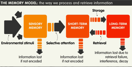
All of the time, our five senses are taking in a surplus of environmental stimuli, filtering it, and discarding irrelevant information. When the stimulus has ended and an impression remains, it is temporarily recorded in our minds. This is known as Sensory Memory. It often happens unconsciously and only lasts split seconds.
Our mind then goes through two processes to get the information from Sensory Memory to Short Term Memory. The first process is pattern recognition, where we actively search through our Long Term Memory to find a matching pattern for the new raw data. The second process involves focusing our attention on the stimulus until it moves into our Short Term Memory where it is encoded primarily acoustically and occasionally visually.
Our Short Term Memory typically only lasts 30 seconds and has limited capacity to store information because it all occurs in the frontal lobe of our brain. You remember the prefrontal lobe from my previous post, don't you?
There is no definite number to how many items we can store in our STM at once. One famous theory suggested there was a capacity of 7 plus or minus 2, but this has been disproved [9] and is now suggested to be even lower. By 'chunking' information into meaningful groups (think telephone numbers remembered in groups of 3's or 4's) we can optimise the "space" in our STM.
After we have stored the information temporarily in our STM we can encode the information semantically by creating mental associations and with frequent rehearsal in our Long Term Memory which is spread all throughout the brain in our neural connections.
The final act our memory performs is retrieval, where we pull the memory out of storage and reverse the process of encoding. But this isn't always a straight forward process....
Distorted Memory
"The process of remembering involves the retrieval of information which has been unknowingly altered in order that it is compatible with pre-existing knowledge." -Neurophilosophy
Let's look at one study specific to Short Term Memory that demonstrates how our memory often fails us:
"In a study conducted by Intons-Peterson et. al (3), both younger and older adults were asked to remember the following list: candy, sour, sugar, bitter, good, taste, tooth, nice, honey, soda, chocolate, heart, cake, eat, and pie. They were then asked to take a minute to write down all remembered words. The next test entailed that subjects consider the words taste, point, sweet and identify which word was included in the original list. An overwhelming 80-90% of participants confidently, but incorrectly, selected the word sweet. While the word sweet yields a close association to the presented collective of words, this association should not nullify the fact that its selection still results in a memory malfunction. ....Incidents such as these are frightening reminders of the memory's fallibility."
Yes, our memory can be deceptive and as Daniel L. Schacter, a Harvard psychologist, explains in his renowned book 'The Seven Sins of Memory' [10] it is deceptive in seven distinct ways:
- Transience
- Absent-mindedness
- Blocking
- Suggestibility
- Bias
- Persistence
- Misattribution
But I'll only focus on the ones particularly relevant to the web:
Transience
The weakening or loss of memory over time, regardless of age. For instance, you might clearly remember what background you chose for your MySpace profile back in 2001, but now it is (fortunately) a vague memory. "I'm pretty sure it was pink and had dancing stars with anime kitten faces on them...."
Suggestibility
Information that is inaccurately added to memories due to leading questions and suggestion. This commonly happens to eyewitnesses to crimes being repeatedly interviewed as their stories change based on the questions, but can also happen during the interview stages of UX research with SMEs and users. "So would the best solution be something like an Apple product interface?"
Bias
The editing or rewriting of past memories skewed by our current knowledge and beliefs. "I always knew online dating would become mainstream."
Misattribution
Assigning a memory to the wrong source or context. For instance, saying "I heard on the news the other night that Farmville was responsible for brain cell depletion in its regular users.." when actually you read it on Twitter.
But how does this affect UX design?
All of the above 'sins' of memory are particularly relevant to the user research stage. When one conducts interviews with SMEs or users, they need to take what is said with a pinch of salt: "self-reporting" is often inconsistent due to the fact that memories are not as accurate as we'd like to think they are. In addition, if the user or SME hasn't used a similar system in a long time, their memory may have decayed . Memories we don't use are erased from our Long Term Memory.
In another study by Sir Frederick Bartlett, a 20th century British psychologist, he asked subjects to read a Native American folktale and re-tell the story several times throughout the course of a year.
What he discovered was that the subjects reconstructed the tale to fit with their personal biases and beliefs:
"Participants omitted information they regarded as irrelevant, changed the emphasis to points they considered to be significant, and rationalized the parts that did not make sense, to make the story more comprehensible to themselves. In other words, memory is reconstructive rather that reproductive." - Neurophilosphy
As we can see, it's almost to be expected that human memory will err. This is why it is so, so, so crucial to conduct observational user research in place of (or in addition to) user interviews. In short, watch what they do, not what they say! Remember that ;)
During the design phase, we should also pay attention to the 'Seven Sins of Memory'. With Short Term Memory only lasting 30 seconds at best, a conscientious interface would ensure that the users will not have to remember every step in a task flow, but will be guided easily through it.
In addition, the limited capacity for STM implies we should not bombard users with a surplus of information all at once that they will never be able to focus on and remember for more than a few seconds. Designs should direct the users' attention to the task at hand.
With visual design tools like distinctiveness (making information stand out), primacy (important information first), frequency (information repeated as needed), and associations (positioning information/objects to suggest relationships- think 'chunking') we can help our users store more information in their Sensory and Short Term Memory. This will ultimately help them more effectively navigate our system and pinpoint key information they need to remember.
One final thought on an approach to making the system more user-friendly: maintaining consistency throughout navigation menus and with interaction patterns means that the user only has to program their mind once to this behaviour.
"If we remembered everything, we would have too much information to sift through to find the important things that affect our livelihood."
So now that you've finished reading this section, read it again. Over and over, until your mind can recite its key points and hopefully then it will be encoded for Long Term Memory. ;)
5. People are Social
Humans beings are social animals.
We are fundamentally driven by the need to belong and to have the approval of our peers. This urge to connect is at our core because of its ability to raise our chances of survival. When we act in accordance with the beliefs, suggestions and commands of the collective, it helps us to reach our goals, including the most primal of sustenance and shelter. Since the nomadic times, when we began hunting in our immediate families we quickly learned that joining forces and hunting together in larger groups meant bigger kills and greater chances of avoiding hunger.
"Humans are social animals and the urge to connect is basic survival, practically, emotionally, and genetically."- Pamela Rutledge, Ph.D.
For over 100,000 years, we have traded and exchanged between groups in order to draw upon other's specialisation and raise each other's living standards.
We all know little bits of information, but none of us know everything.
Through exchange, we've surpassed our own knowledge, creating the ability for us to do things that we (individually) can't even comprehend. For instance, we all know what a toaster is.. but how many of us can fashion one entirely on our own? We'd need to know how to drill for oil, how to make plastic, how to wire electrics, how to create heating elements, how to create screws, how to extract and melt metal, and the list goes on.
In order for humanity to evolve, it's not important how intelligent the individual is, but how well we communicate and cooperate as a people. By evolving to communicate and have language, we became even more connected and increased our chances of survival.
We could warn each other of danger, guide each other and share wisdom. But with this ability to speak, also came the need to be heard.
Humans want to be heard
...in order to share emotions and ideas, and to have these emotions and ideas validated. We look for guidance from others on what we should do and how we should act. This has always been and will always be the case.
"It's a basic element of humanity to want to be heard. Communication has evolved to where it is today because people fundamentally want to communicate. And not just communicate for its own sake, but to be heard and validated. If that weren't the case we wouldn't have Twitter and Facebook."-Brad Waters, Psychology Today
Another way that we learned to cooperate was through imitation. When we observe someone doing an activity, our brain has 'mirror neurons' that mimic the activity as if we were doing it ourselves. Through this imitation we quickly learn new skills and behaviours, from birth all the way through adulthood.
Humans are undoubtedly social beings and because of this we will always use technology to be social as a form of self-expression. If we look at the history of the internet, we can see how this happened as the internet itself was intended for military purposes but evolved to connect the world socially. Since its birth, this happened over and over again, from IRC to BBS systems to SixDegrees and Friendster and Myspace; to Geocities, LinkedIn, StumbleUpon, Flickr and Facebook. We have adapted the internet to speak our language; a language of interconnectedness and sharing.
Today, nearly four out of five web users visits a social networking site on a monthly basis. Twitter estimates that it has at least 325 million users every 24 hours. Facebook claims that its users spend over 700 billion minutes on the site each month.
We communicate online. We share online. And we look for guidance online. With regards to the last one, we can see this brilliantly demonstrated with something called 'The Amazon Effect', or 'people-powered product research'. 'The Amazon Effect' is a pattern where internet shoppers commonly go to Amazon.com first, often skipping the content written by Amazon to scroll down to the user reviews.
"I already know what it's going to say, it's going to tell me how great their product is. Why would I need to read that? If I want to know the truth, I have to read what other people like me thought about it." -'Designing for the Social Web', Josh Porter
Users look at other people's experiences with the product and find guidance on whether or not to invest in it themselves, thus learning from our shared experiences and knowledge.
But how does all of this affect UX?
From the initial stages of the UX research, we can see the importance of user observation based on our skill of mimicry. By observing a user in person, our brains imitate their actions allowing us to better comprehend the activities they partake in. This strengthens our understanding of their needs and task flows, and allows us to create solutions with greater empathy and clarity of the problem.
When it comes to designing the UX, we need to take into consideration the necessity for a social outlet within our website or application. Allow for greater social interconnectedness in your designs so that people can go to each other for guidance and advice within your application, such as with ratings, reviews, news and forums. Allow users to forge helpful relationships, be it with similar users or with customer support. Give people an awareness of the size of the community they operate in to give them a sense of belonging as well as the choice of where they want to fit in within the community by establishing their profile.
Social Nature Brings Innovation
Thanks to the social nature of humans and all of the connections people have been making through the use of technology, we have invented and evolved more tools in the past 100 years, than we did in a million years back in our hunter-gatherer days with the design evolution of our hand tools.
Today everyone is able to have their ideas and allow them to be shared on a global scale. It is because of this that we as a people are accelerating our rate of innovation, and we should encourage this in every way we can.
...So don't feel too bad if your boss catches you on Facebook at work. Tell him/her you are satisfying a core human need.
The second part of this article has been published in the Winter 2011 issue of Methods & Tools.
References
- What Makes Them Click
- The Psychologist's View of UX Design
- Don't Make Me Think: A Common Sense Approach to Web Usability, Steve Krug, New Riders Press, 978-0321344755
- Herbert Simon
- clickable
- New York Yankees website is a cluttered mess
- Listen to the pattern
- Psychology of Today
- The 7±2 Urban Legend
- The seven sins of memory
Related UX and software development articles
Lean UX in Public Sector? - Part 1: Deciding Our Way of Working
Lean UX in Public Sector? - Part 2: Getting our Facts Straight Before Implementation
The UX Runway - Integrating UX, Lean and Scrum Cohesively
Click here to view the complete list of archived articles
This article was originally published in the Fall 2011 issue of Methods & Tools
|
Methods & Tools Software Testing Magazine The Scrum Expert |
Copyright © by 1995-2025 Martinig & Associates |
Privacy
Follow Methods & Tools on


