|
Software Development Magazine - Project Management, Programming, Software Testing |
|
Scrum Expert - Articles, tools, videos, news and other resources on Agile, Scrum and Kanban |
Lean UX in Public Sector? - Part 2: Getting our Facts Straight Before Implementation
Anna Forss, Erik Nilsson, Sebastian Lejnehed, Jenny Wilander, Försäkringskassan
During a three iterations pre-study, the Swedish Social Insurance agency (Försäkringskassan) has to define the basic concept for the content structure and navigation on its official web site. In order to meet customer needs, a Lean UX approach is used to iterate the concepts enough so that it should be possible to start the implementation phase directly after the pre-study.
After two sprints, the team has challenged a lot of their initial hypothesizes and is still working with two separate concepts. It has now to decide the main concept during the final three weeks of the pre-study. Part 1 of this article with the report on the first two sprints was published in the Summer 2015 issue of Methods & Tools.
Third iteration - formulating the MVP
When the third and final iteration in our pre-study was ready to start, our most important question was to decide what to work with in the sprint, and what to leave for the implementation project. We would not have a full concept, which we knew from the beginning, but as the finish line was getting near, this issue became very concrete.
The team felt that they were supposed to have targeted a single concept by this time, but the project owner was happy that the team continued to work with two concepts. We had discussed this from the very beginning: continue working with as many ideas as long as it is plausible. If we had only one solution, we would probably fall a little bit more in love with it. The risk is that you cling too long to a failing single solution if you don't have a backup.
The team decided to focus on larger screens as the biggest question for the sprint. We had decided to work first for mobile in this project, and the team really stuck to that plan, working with the mobile scenarios in mind for the first 6 weeks. Now we needed to verify that we could scale to the bigger screens as well.
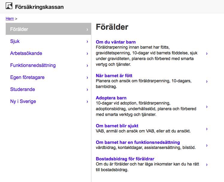
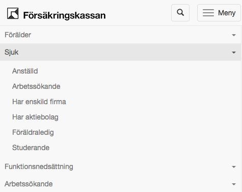
Another question to be discussed was if we could scale the concept to other customer groups than just the private citizens. About 90% of the visitors are private citizens, but the other customer groups are also important. A special challenge is that for the customer experience for the private citizens to work, it needed to work also for the other groups. For example, long-term sick citizens who are employed need their employer to register that their employee has been away in order for the employee to get their benefits. We did not make any usability studies for the customer groups but it was important to verify that these sections of the site can be included in the concept.
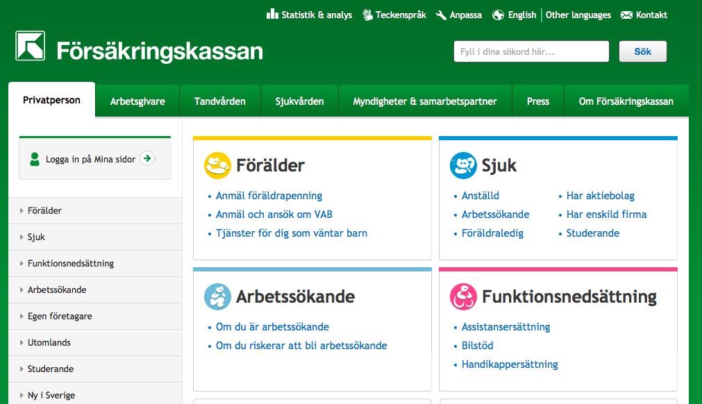
Above: Current web site. Tabs are used for major customer groups. Default is private citizens, which is also the largest customer segment.
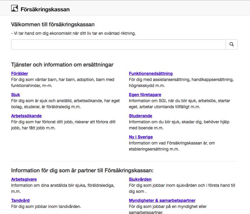
Above: Desktop version of one of the prototypes. Tabs are removed and all segments can instead be seen in the same list.
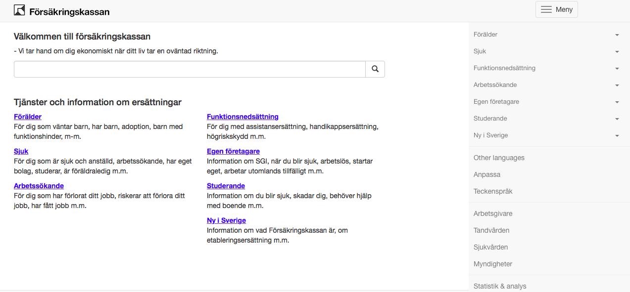
Above: Desktop version of the other desktop prototype. Less common customer segments are here found in the menu, which must be clicked or tapped to be seen.
Since the prototype tool is responsive, we tested directly the concepts with responsive design. The interaction and graphical designers had to think about all the suggested break points. What we had discussed from start was now clear: too many break points are hard to maintain and to get a good experience.
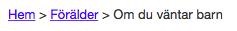
All users had not understood the breadcrumbs and the team was curious if they had used the wrong convention. By including > signs, they hoped they were more clear:
Above: Breadcrumbs
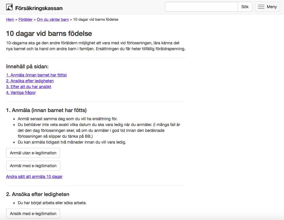
The article pages were restructured with the following principle: first a headline and a short description followed by a clear table of contents for the page. Each line in the table of content is linked to that specific section.
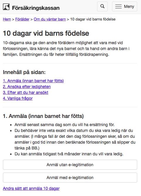
Above: Restructured article pages
Changes to search and content focused navigation
Besides the changes already discussed, Miller columns were included on section pages on all screen sizes above smartphone. Miller columns, also known as cascading lists, are a browsing technique that can be applied to tree structures. The columns allow multiple levels of the hierarchy to be open at once and provide a visual representation of the current location.
Above: Miller columns on search and content focused navigation
Changes to menu-based navigation
As so many users hadn't spotted or understood the menu icon, a describing text was added to the button.

To simplify things for customers who are moving between devices and for our service staff trying to help customers, I had asked the team to keep the conventions between screen width so the menu was not expanded for larger screens and the button looks the same on all screens.
The third and final test run was focused on the following questions:
- Are the navigation elements on the page enough to clarify for the customer where she is on the site?
- Is the menu used more if the menu icon is complemented with a label?
- Does the new structure of the article page make it easier for customers to understand the benefit?
- What happens if a customer visit the site on a mobile device and afterwards on a desktop computer? Can she recognize the conventions?
- Understand more about the free text search function mainly within two areas: does customers expect that the search result is within the section where the customer is? Would suggestions directly while typing help the users and under which circumstances?
- Do the entrances for other groups affect the navigation for private citizens? (The tests did not include the navigation for the customer groups outside private citizens)
Search and content-based navigation
The team decided to test a new concept for the article pages. Many of the benefits require the customer to go through a number of steps and this caused the pages to become lengthy. The team decided to use the "table of content" not as anchor links but rather as a way to change the content of the page. When the page about the benefit was loaded, the customer could see the first step. In order to see the next step, a continue-link was found at the end of the text (Nästa steg: Ansök).

Above: Prototype with Next step link on the bottom of the page
If that link is clicked or if the customer clicked the link in the "table of content", the next step in the process was displayed:
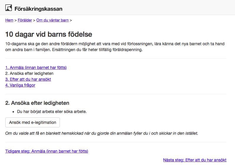
Above: Middle step of process with continue and go back links on the bottom of the page
The tests conducted on the search and content based navigation provided these findings:
- No test subjects were asking for a menu option - it was not missed by anyone
- Breadcrumbs are important and used a lot
- The "Next step" links were interpreted as read more rather than next step in the process and the customers instead used the table of content for navigation. They didn't understand that they remained on the same page with only changes in the content. This clearly indicated that this type of navigation did not work.
- The line in the "table of content" which was not blue/purple and underlined was understood to be the displayed section.
- The customers did not like the Miller columns. They felt that the breadcrumbs had the same functionality.
- The customers appreciated that the user interface was easy to recognize when changing device.
Menu based navigation
The team had struggled with understanding if the menu in the top bar was useful or not for the customers. Many customers in the previous tests had not found the menu and hadn't complained about it, but the customers who found the menu used it all the time. This time, the menu icon was associated to a descriptive label.
- The menu was well used and easily recognized with the label
- A menu option with a sub-option has two tap/click options: one to expand sub options and one to select the top level. This must be very clear in the execution to be understood by the customers
The menu in the mobile interface caused some problems: when expanded it was hard for the customers to understand that this was not a page but rather a menu.
The anchor links which were used in this prototype worked better than the concept with the content being switched depending on the customer's selection. It was still not obvious for the customers how the benefit worked, but it was definitely clearer with this design.
General conclusions
- The breadcrumbs worked very well. Some customers expected to also see the current page in the breadcrumb but everyone thought it was clear by the page heading.
- Free text search should be for the whole site, not just the current section
- Suggestions are welcome, but it is hard to make them work on a mobile screen if keyboard is expanded
- The texts from the Swedish social insurance were confusing and caused problems for the customers. This is a well-known problem that is hard to solve since the terms are specified in legislation.
- Scrolling is not a problem but the heading must be very clear. This means that if the legal term is confusing, it might be better not to use it in the heading.
- The information should be prioritized so that the customer directly can see if she is eligible or not.
- Remove texts like "Here you can read about..." and get to the point quicker if you target the mobile user
- The logotype should always link to the start page
- It is very positive if the pages on different devices are as similar as possible
- Logging on should be in the upper right corner
- It is important to separate visually and clearly on article pages what is information and what is an action.
- If numbering is used (for example in the "table of content"), it must be a clear step by step process.
Conclusions from all three test rounds
There are so many small and big findings from the usability study that it is almost hard to pick a few key points, but the most important one is: there are more assumptions than you think and the only way to find these are to test on real people.
Here are some important recommendations:
- If you do tests, you need to do it often, combining small in-the-corridor-guerilla-tests with planned studies with an external objective part. Small changes can have huge impact and if you don’t spot these, there is a big risk that you misinterpret the results.
- Don’t get upset if the first test rounds creates more questions than answers. This is probably an indication that you’re going in the right direction and have performed good tests. I would be worried if everything seemed validated directly.
- Share the results with everyone. It is not a coincidence that Försäkringskassan has decided to share these findings with the public. The feedback we received was worth so much. We held many internal discussions on the results as well. This has both given us more questions (for example if the test subjects are valid for all important customer groups) but also given the staff a chance to understand not only what will change but also why the UX has been designed that way.
These are the key findings concerning the UX. As the web site is a content-rich portal for a public agency, these findings might not apply to other industries and web sites.
- Designing mobile first works: The mobile-first approach helped us prioritize and simplify. This made the experience better for everyone.
- People want to navigate using the large area of the page: Most people don’t want to hassle with menus but instead tap on the large area of the page
- Don’t be concerned by a long page: Scrolling is not an issue anymore. Of course, the top area is important for overview of the page but if this area catches the interest, scrolling is not a problem.
- Don’t split the information between pages: This is connected to the point above. If you have concerns with a lot of text, splitting the page into many pages does not help. Instead, it just brings more confusion, especially on smaller screens.
- Explain headlines: Many content rich web sites have their specific lingua, which might not make sense to everyone. By combining the headline with a single line on what the headline means can make all the difference in the world
- Start with accessibility: It is hard to adapt a current concept with accessibility but if you start with that perspective, it will actually help with the UX. Remember that people with dyslexia, ADHD and cognitive disabilities should also be included in your test group. If you make the site good for these groups, everyone will benefit.
Lean UX rocks! Even/especially in government agencies
The outcome was very positive: we had tested a number of hypothesizes and some had been validated and some had been invalidated. We now have two concepts to continue working with during the implementation phase. We will continue doing the tests and using the methods we have tested during the pre-study. We hope that you will follow us during this journey.
Read the part 1 of this article Lean UX in Public Sector? - Part 1: Deciding Our Way of Working
Agile and UX Articles
The UX Runway - Integrating UX, Lean and Scrum Cohesively
Agile and UX Resources
Click here to view the complete list of archived articles
This article was originally published in the Fall 2015 issue of Methods & Tools
|
Methods & Tools Software Testing Magazine The Scrum Expert |
|
Discover the best available Open Source Project Management Tools (Gantt, Scrum, Kanban) Explore a list of Free and Open Source Scrum Tools for Agile Software Project Management |
Copyright © by 1995-2025 Martinig & Associates |
Privacy
Follow Methods & Tools on


