Lean UX in Public Sector? - Part 1: Deciding Our Way of Working
Anna Forss, Erik Nilsson, Sebastian Lejnehed, Jenny Wilander,Försäkringskassan
I guess Agile is not what you think about when you hear "public sector" or "government agency" and if you think that itĺs not possible to go there, you are definitely wrong.
Försäkringskassan is a Swedish government agency, responsible for the Swedish Social Insurance. In practice, we handle 1/4 of the Swedish incomes! Our customers come from every corner of the Swedish society as even the crown princess of Sweden receives a monthly income for her daughter.
For the past four years, Försäkringskassan has gone through a major transformation program with Lean as a business strategy. In parallel, Agile has started to grow as a way of thinking within the development of IT solutions. The customer-facing e-services have been driving the Agile implementation, as we thought that we could try to take the Agile journey to the next level. With a project management method focused on long extensive pre-studies, we wanted to challenge it by testing Lean UX and conducting a pre-study that would produce user tested prototypes rather than text documents.
Lean UX is a concept developed by Jeff Gothelf, using the Lean Startup Concept as the basic principle for developing UX. Working in a consistent way with rapid experiments and real tests, Lean UX enables development teams not only to develop wonderful user experience, they also develop a way of thinking where the experience is based on actual customer insights.
The pre-study
The goal of the pre-study was to prepare Försäkringskassan for the next generation of the web site. The main purpose was to make the web site and its services available to mobile users, but we wanted at the same time take the next steps towards quicker time to market and life cycle management of both content and design components.
The team was composed of about 10 people with varying competencies. All Försäkringskassan projects are sponsored by a project owner who is responsible for outside communication and for the overall project vision. The product owner, who works more directly with the team, makes this vision concrete. The project manager plays also the role of Scrum master the design team as well as the development team. The design team consisted of three interaction designers and two art directors. The team also got a lot of input from the head of UX and visual design, a web communicator and a representative from the Communications department. This group focused on ensuring that the team followed the overall visual and communicative profile and tonality.
Methods
I'm happy to say that all team members agreed on a scientific Agile method for developing the new navigation. Since Lean is the business strategy for Försäkringskassan, we can always go back to the basic PDCA thinking. The work was conducted in three iterations. The final objective was to have a hypothesis for the navigation that was crisp enough for us to go into the implementation phase of the project. Step 1 was about identifying what was needed but even more important: what could we leave out for the implementation phase.
Key values
User input is king
The user input was crucial. We needed to work with real customers from the very start and we wanted to see them using real devices during their tests. Hand in hand with this requirement, we did not want to design anything that was not possible with responsive design so the team started designing directly with a tool that created clickable prototypes that can run on a real responsive web site.
The team decided that we needed to identify a target scenario and target group for the basic navigation of the whole site. It was not necessary to specify the navigation within services in these early stages, but if we didn't have an idea on how you move around on the site in a general way, we were sure to go in the wrong direction in the project. Since the information we have on the web site is complicated, we needed also to understand how individuals could find specific information about a specific area on the site.
One of the major challenges is that everyone in Sweden can be a customer of Försäkringskassan. This means that basically everyone is within the target group but you can't test for everyone so early in the project. We decided that since a large portion of the customers are parents or parents to be, this was a very important target group and if we could meet their needs, chances are that we could also meet the needs of the rest of the customer segments. The team therefore decided to focus on parents in these early tests.
Read up on your web statistics and use it to formulate questions, not to get arguments for your assumptions
The web statistics also became a foundation in these early stages. As we tried to answer questions directly not with guesses but actual values so that we could all see that some of the assumptions we made were right. Some assumptions could also be verified and could therefore be excluded from the actual tests.
Iterate iterate iterate
If you can hasten the user input - do it. If you can validate your assumptions quicker - do it. By shortening the feedback loop, you would ensure that you did not walk in the wrong direction too long and you would not fall too much in love with your ideas before testing them with real users.
Iteration 1 - the first hypothesis
For the first sprint, the hypothesis was that at least one of the four navigation concepts we found from evaluating large sites that are often used by our customer groups (people living in Sweden) would also work for navigating the Försäkringskassan content.
Four concepts were defined:
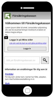
Below is the first concept: search based navigation. The upper section of the page shows branding but the often-found menu option is lacking. On the left side: start page. The search bar is very prominent. On the right side: A top level page.
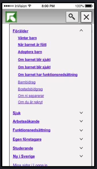
Below you can see the second concept: menu based with one level. In this case, the search icon and the menu option can be found next to the branding on the very top of the page. The search option is not prominent on the start page. On the right, the menu can be seen as it would look like when clicked. The hierarchy of the content is very deep but the menu just shows the top level. The other two concepts included lower levels of the hierarchy in the menu but the principle was the same.
In order to test the menu bar, the team also realized that there are two conventions for how to show multiple levels. One option is to expand the menu down:
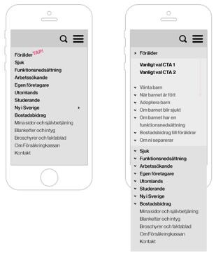
Another option is to expand the menu sideways:
Conclusions
The most significant conclusion for this iteration was that these very early tests were really useful for the upcoming work. A lot of facts turned out to be assumptions and now the team could focus on these assumptions early in the process. The team decided to work with both the menu and the search/content concepts but narrowed the work to one concept with the menu bar.
Iteration 2 - Understanding the real questions
The second sprint was based on the findings from the first iteration. I was happy to see that the team did not just accept the findings from the first iteration. Instead, they sought issues with their own methodology. They found for instance that the test subjects who did not have the menu option in the top bar looked for it, but when the menu was there and identified as a menu, it was used a lot by the users. Was the menu useful or not? To answer this question, the team decided to not abandon the menu option and instead to fine tune the test case. It is easy to just jump to a conclusion from a usability study but often you need to validate the results first.
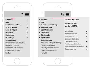
Below: The top menu in one of the prototypes from sprint 2:
Since the team had not found that the testing of the number of levels gave that much at this point, they decided to work with just one version: a two level hierarchy.
Below: A two level hierarchy menu. The structure of the information means a deep hierarchy, but during the tests only the upper two levels were displayed in the prototype.
The team also decided to include a restructuring of the content of one of the pages for the test. A challenge within the project is that the content is derived from the laws governing public social insurance in Sweden. This means that the actual wording cannot be changed that easily and that there can be many consequences when doing so. Since the content has been rewritten not so long ago, the project had therefore decided not to change the actual wording on the pages but the structure of the content.
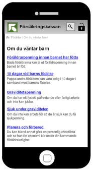
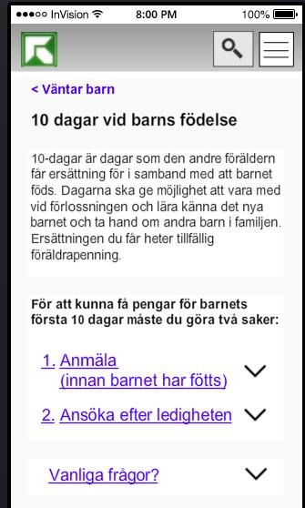
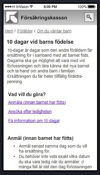
Below: the upper part of the current page on benefits for parents the days after the birth not yet adapted for mobile users.

Below: the upper part of the wireframes for page on benefits for parents the days after the birth.
Some interesting questions also surfaced during the first test iteration. Here are the highest prioritized:
In order to test these questions, we needed a richer prototype. A digital tool for interactive prototyping was introduced and the team created the two concept prototypes to prepare for the new usability studies. We would now be able to see with an external usability study if our assumptions seemed more likely or if we would have to go start all over again. It is however better to know that after 5 weeks than a week before launch (or even worse: after launch).
Before the second set of usability tests, the team made some changes to the prototypes.
Concept without menu in top bar
The concept now included the following pages:
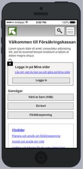
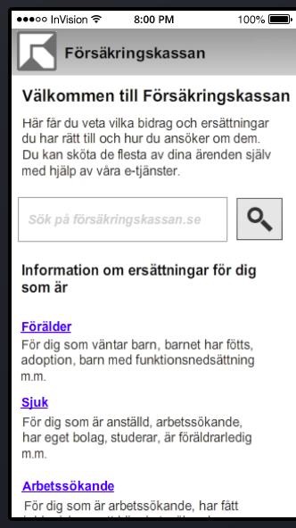
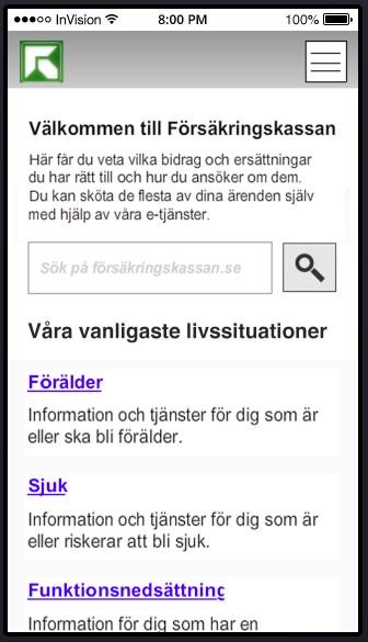
Below: Start Page with entry points to different life situation. If the customer is in the life situation of parenthood, there are multiple options, which can be seen on the right side of the page.
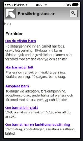
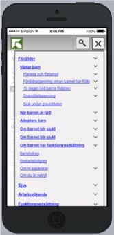
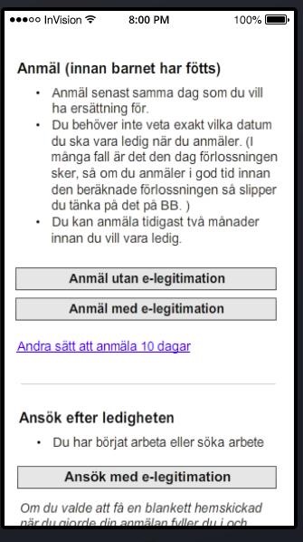
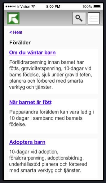
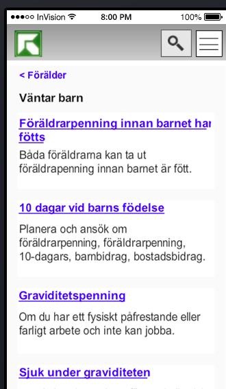
Below: Third level in hierarchy on the left side. As you can see, the information just for the future parents is large. This is one of the challenges to be tested in the pre-study: can we make the customers understand where they are and what to select among all the possible options. On the right side the upper part of the page for benefits for parents around childbirth. The links are anchor links to sections on the lower part of the page.
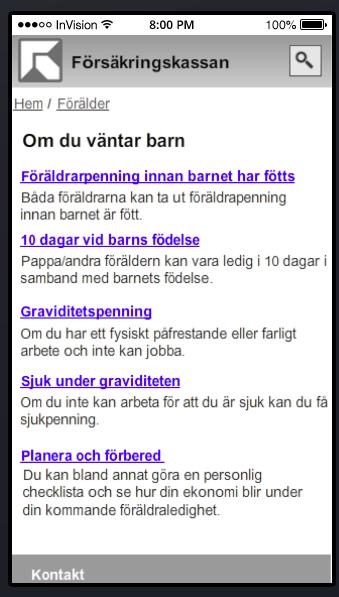
Below: If an anchor link is clicked on the page about benefits around childbirth, the customer can read the rules that apply to this benefit. As you can apply for this in many ways, the two major forms are highlighted as calls to action, while there is a link to the less common options. The reason for highlighting two options is that one requires a e-id, which not all customers have but which is recommended for a complete digital service.
Concept with menu in top bar
The following changes were done:
Below: Start page and page about benefits for parents.
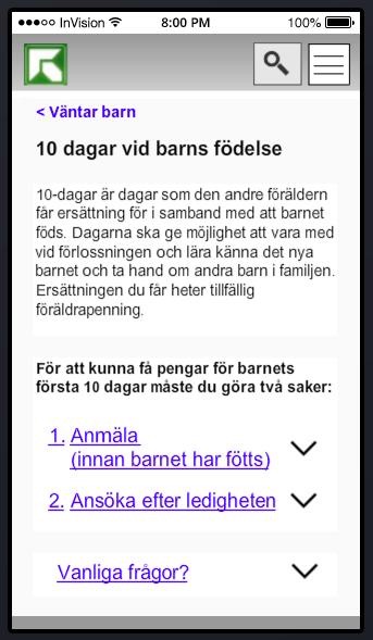
Below: Page about benefits for future parents and page about benefits for parents around birth. The process steps are shown with accordion.
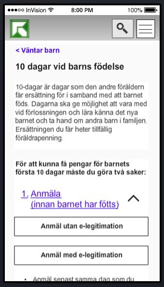
Below: Page with accordion expanded so the calls to action are displayed
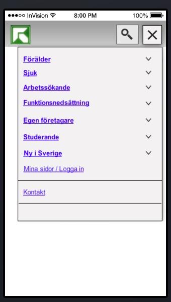
Below: Top bar menu option tapped (on left side) and expanded when a top-level option is expanded (on the right side)
The purpose of the second round of tests was to understand how users preferred to navigate on the web site. A challenge for Försäkringskassan is that there is a lot of information and most of it is about a specific form of benefit. As the rules are complicated and very specific to different groups, there is a challenge how much of the variation should be displayed to all customers, how much is to be found in detailed sections and which customer groups have such a complicated unique situation that they should contact the service centers? Additionally, since a substantial part of the customer group is eligible for multiple benefits, they need to be able to navigate between sections easily. The team focused the tests around the following questions:
The tests also included some specific areas of the site. The project had identified the benefits for parents around the birth to be a good area for tests. It is not obvious if this is a benefit for parents before or after birth and for many customers, this is the first benefit they apply for.
Web statistics had shown that many of the mobile users sought information about how to contact Försäkringskassan. This is not uncommon for all customer groups, but mobile users are more likely to seek contact details than others. The test did not focus on the actual contact page but the team wanted to make sure that this crucial area was easily found for the mobile customer segment.
Conclusions
As these were the first tests we did with an external test agency, we were happy that our assumptions so far had not been far from the mark. The tests confirmed a lot of what the team had seen during the first guerrilla tests. Both our first simple tests and the external tests were crucial. During the first simple tests, the team could see obvious flaws and better fine tune the prototypes. During the external tests, the tests became blinded and more validated. An important conclusion was that both methods will be used during the whole project and are crucial for its success.
The team decided that both concepts should be included in the work for the third sprint. Both concepts had flaws and positive aspects and more tuning was needed before deciding on one concept. Also, the tests had only been conducted on a small test group and they needed to be done with a larger customer group.
We now had one iteration left before moving into implementationů
This third iteration will be described in an article published in the Fall 2015 of Methods & Tools.
Read the part 2 of this article Lean UX in Public Sector? - Part 2: Getting our Facts Straight Before Implementation
Agile and UX Articles
The UX Runway - Integrating UX, Lean and Scrum Cohesively
Agile and UX Resources
Click here to view the complete list of archived articles
This article was originally published in the Summer 2015 issue of Methods & Tools